
Brand Identity – Communications
Cashpoints.
Save & spend instantly.
The team that introduced AA Smartfuel to New Zealand was preparing to launch a new loyalty programme for the country.
Unlike AA Smartfuel, Cashpoints was not supported by an established parent brand. It needed to stand on its own two feet quickly, building credibility with both the customers who would use it and the retail partners coming on board.
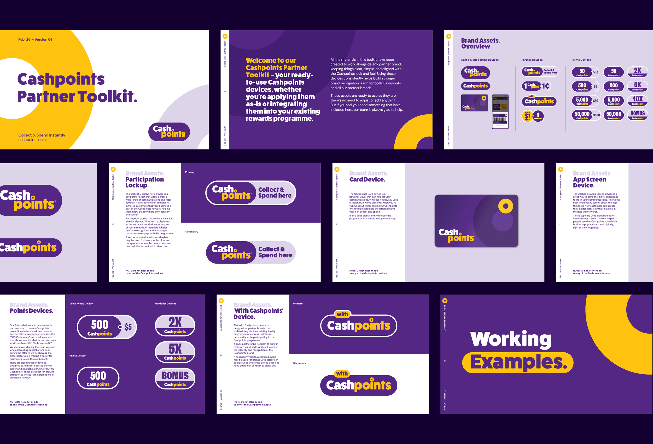
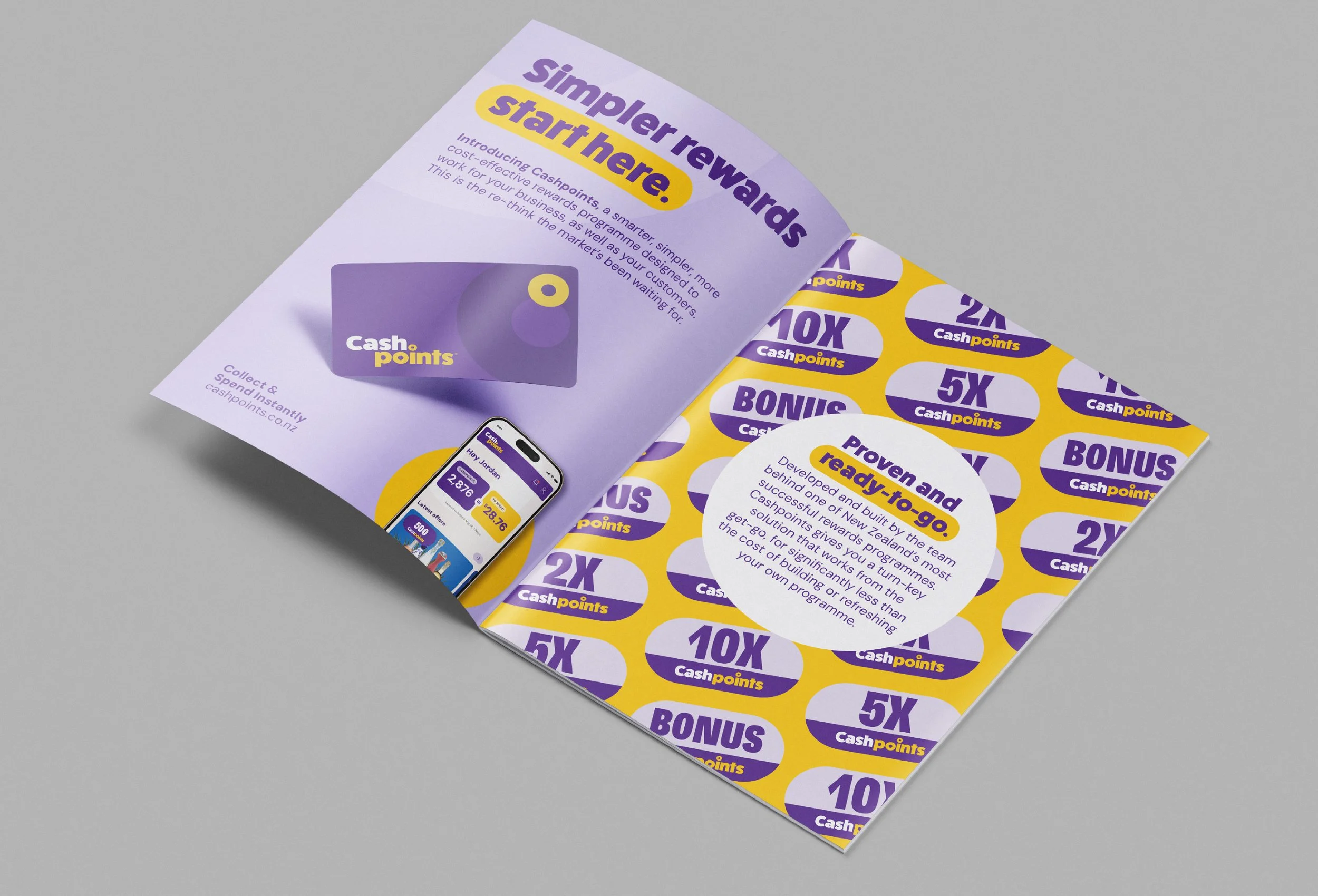
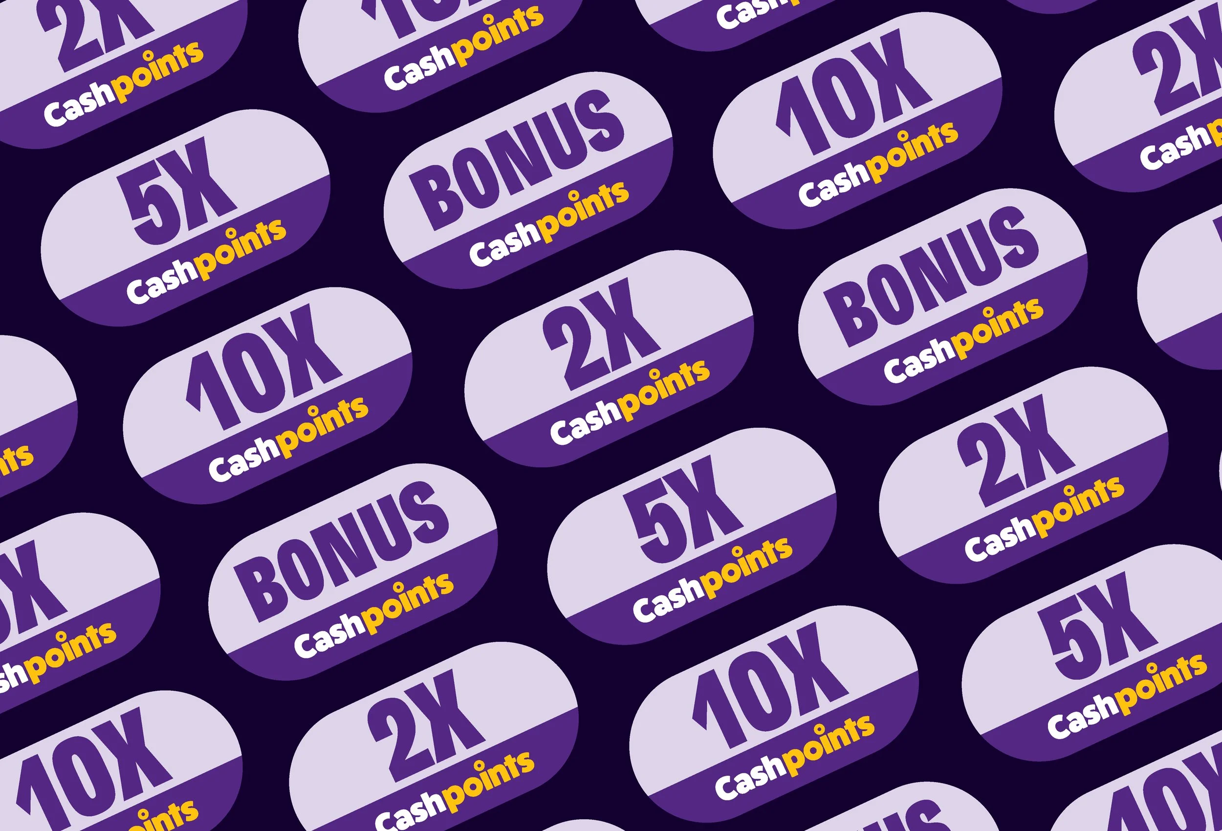
Cashpoints had a clear point of difference in the market: it was simple to use, easy to understand, and offered instant redemption. The brand needed to reflect that same clarity, while standing apart from the competition in a busy and highly promotional retail environment. We built a new brand identity and a flexible system for how Cashpoints would appear across third-party retail partners.
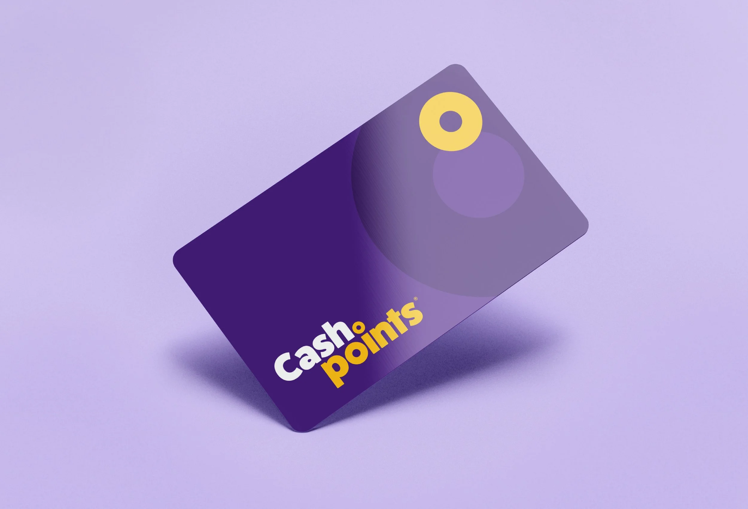
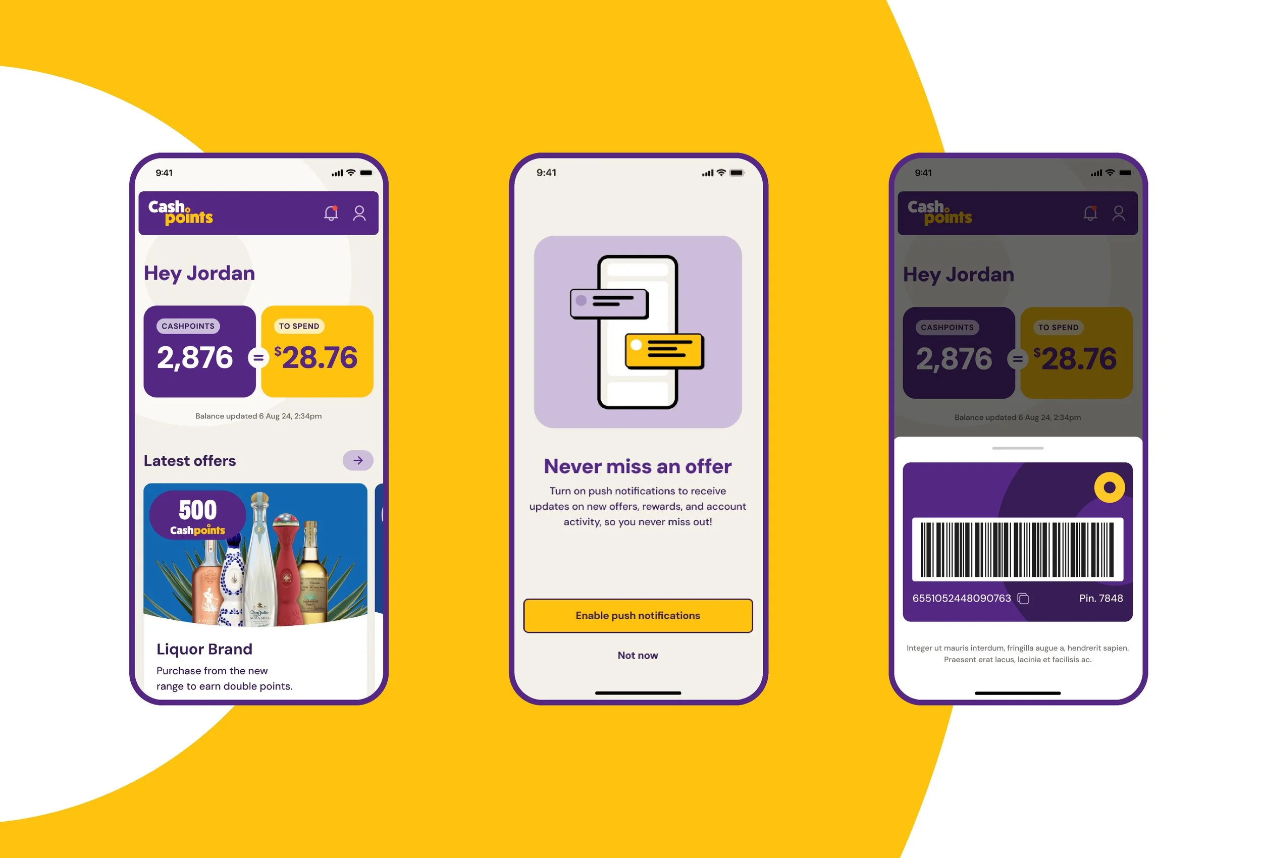
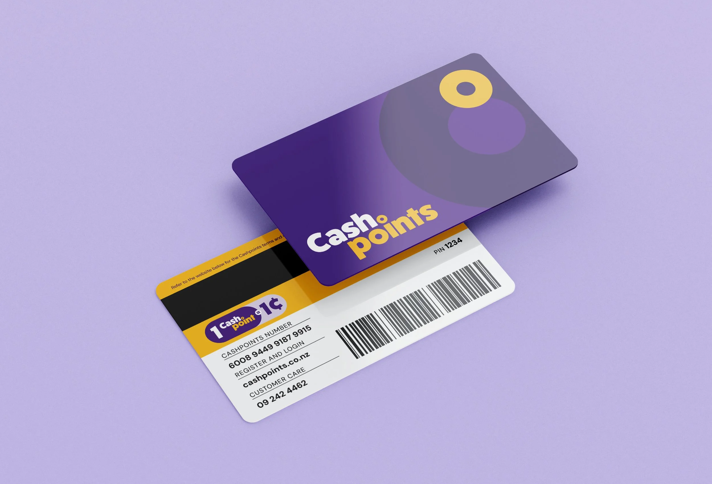
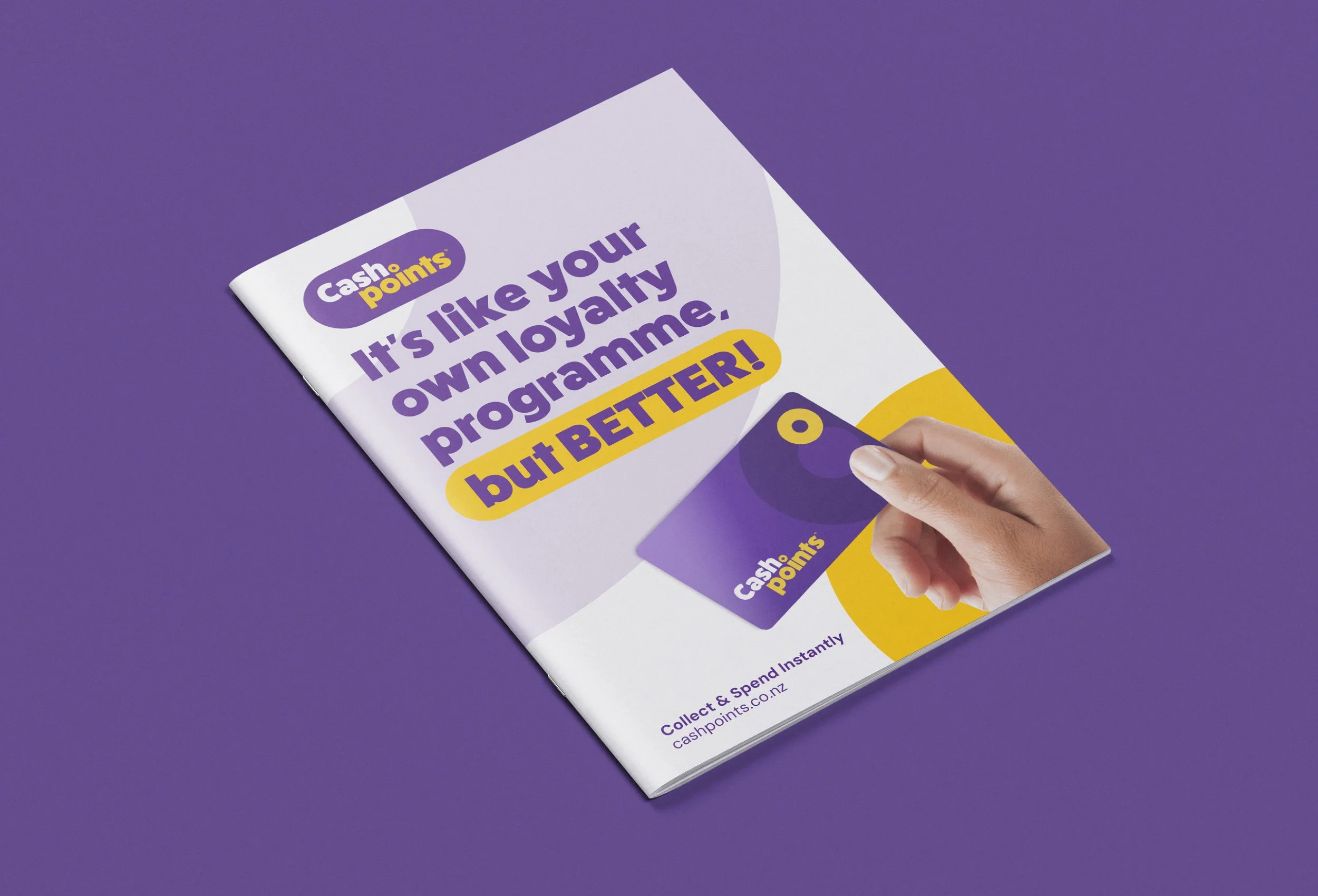
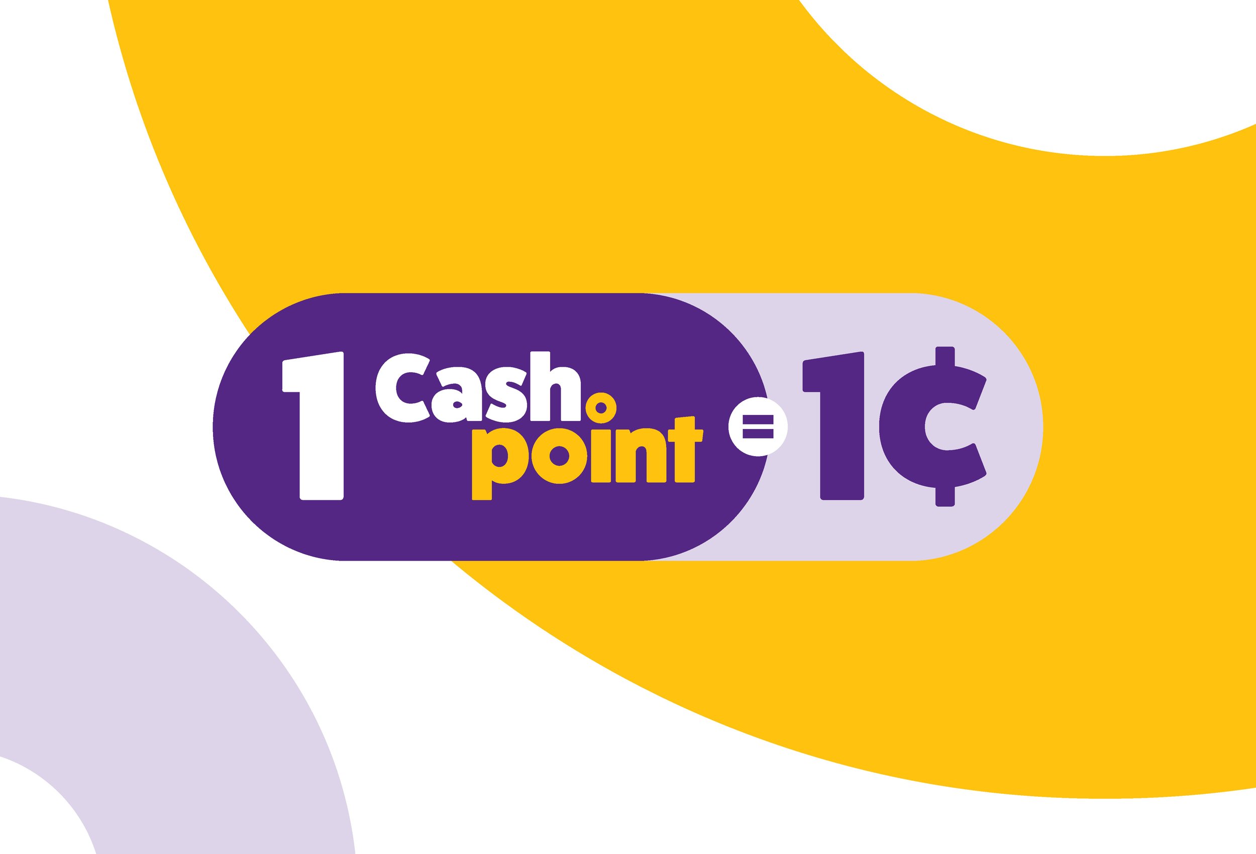
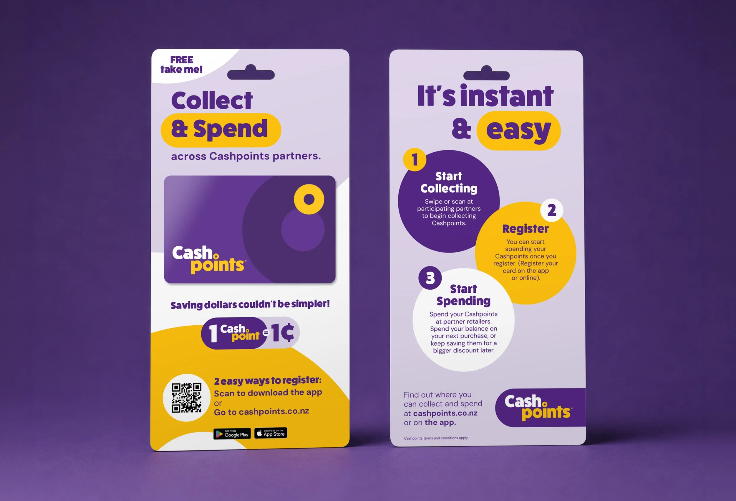
This included the core logo, brand colours, typography, loyalty cards, point-of-sale material, digital design guidelines, and the rules for how the brand would be applied across partner environments. The result was a brand that felt friendly, approachable, and distinctive. In a cluttered retail landscape, Cashpoints had the confidence and clarity to stand apart.